

Images are conceptual design visualisations of colour and light, not photographs of Earendel projects.
Colour is one of the most expressive elements of interior design. It has the ability to influence how a space feels, alter its perceived proportions and establish an atmosphere that extends beyond visual appearance.
From the warmth of earthy neutrals to the quiet sophistication of muted greens and deep architectural tones, every colour contributes to the character of an interior. Its influence is often subtle, yet fundamental to how a space is experienced.
At Earendel Designs, we consider colour an essential component of the design process. Rather than approaching palettes as purely decorative choices, we explore their relationship with architecture, natural light, materiality and the individual needs of each space.
Through considered selection and careful balance, colour becomes an expression of both aesthetic refinement and personal identity.
Understanding the Role of Colour in Interior Design
Colour does more than define the appearance of a room. It establishes visual relationships, creates continuity between spaces and contributes to the overall architectural composition.
Light shades can introduce a sense of openness, while deeper tones may create intimacy and visual definition. Warm colours can make an environment feel inviting, whereas cooler palettes often convey a sense of calm and restraint.
However, the impact of colour is rarely determined by a single shade.
Its effect depends on the interplay of surrounding materials, lighting conditions, proportions and the broader design language.
A carefully selected palette considers these relationships collectively, ensuring that each colour serves a purpose within the overall composition.
The Psychology of Colour and Atmosphere
Colour psychology explores the relationship between colour and human perception, including the associations and emotional responses that different shades may evoke.
Although individual experiences and cultural influences shape these responses, certain colours are commonly associated with particular moods and environments.
Warm neutrals, including ivory, sand and soft beige, often establish a sense of comfort, warmth and understated elegance. Their versatility makes them particularly suited to residential interiors where longevity and visual harmony are essential.
Muted greens introduce a connection to nature and are frequently associated with balance and tranquillity. When combined with natural timber, stone and organic textiles, they can create a grounded, restorative atmosphere.
Soft blues are often perceived as calming and may be particularly effective in bedrooms, private retreats and spaces intended for relaxation.
Deeper tones, such as charcoal, chocolate brown and rich burgundy, can introduce intimacy, sophistication and architectural depth when applied with restraint.
At Earendel, colour psychology is considered alongside the functional requirements and personal preferences of each client. The objective is not to prescribe a particular emotional response, but to create environments that feel appropriate, balanced and intuitively comfortable.
The Timeless Appeal of Neutral Palettes
Neutral colour palettes have become closely associated with contemporary luxury interior design, valued for their versatility, restraint and enduring aesthetic appeal.
Yet a successful neutral interior requires more than the selection of white or beige surfaces.
The subtle differences between warm and cool undertones, the relationship between materials and the introduction of tonal variation all contribute to its character.
A palette of limestone, warm ivory, soft taupe and natural oak, for example, can produce an interior of remarkable depth without relying on pronounced colour contrasts.
These compositions allow architectural features, craftsmanship and carefully selected furnishings to become the defining elements of a space.
For luxury residential projects in Dubai, neutral palettes also provide a refined foundation that responds beautifully to abundant natural light and contemporary architectural forms.
When thoughtfully developed, restraint in colour becomes an expression of sophistication rather than simplicity.
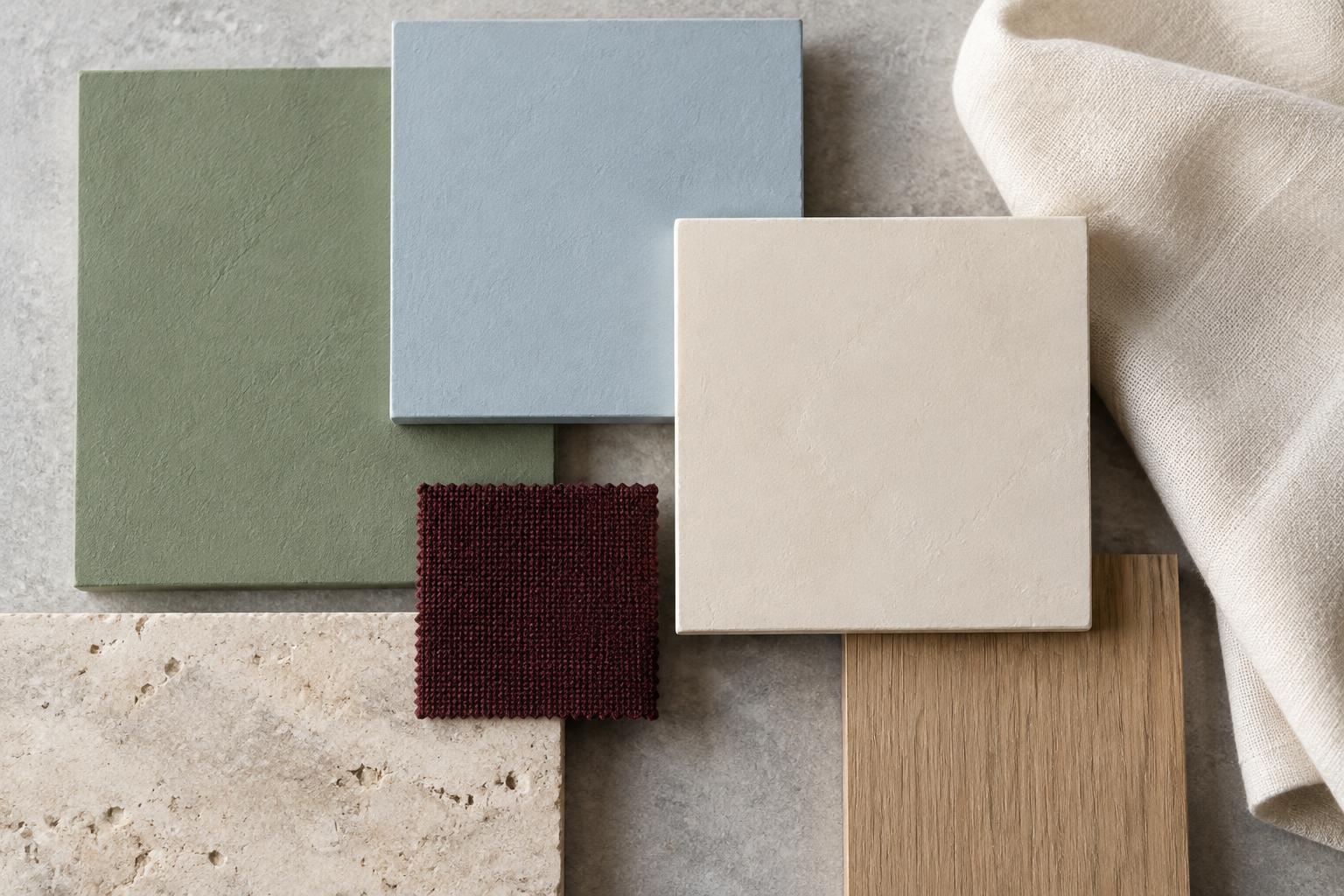
Creating Harmony Through Colour and Materiality
Colour should never be considered independently of texture and material.
The same shade can appear entirely different when applied to painted plaster, natural stone, timber or woven fabric. Surface characteristics influence how light is reflected, absorbed and distributed, subtly altering the perception of colour.
This relationship is fundamental to creating a cohesive interior.
A warm beige wall finish may complement the natural movement of travertine, while darker timber elements introduce contrast and definition. Upholstery in closely related tones can soften the composition, creating continuity without visual monotony.
At Earendel, material and colour palettes are developed as interconnected elements.
By considering their relationship from the early stages of design, we establish interiors in which finishes, furnishings and architectural details form a coherent visual language.
The Influence of Natural and Artificial Light
Light is among the most significant factors affecting how colour is perceived within an interior.
Throughout the day, natural light changes in intensity and character, influencing the appearance of walls, fabrics, stone and decorative finishes.
A warm neutral may appear soft and luminous in morning light, yet develop a richer, more pronounced character as the sun moves across the space.
Artificial lighting introduces an additional dimension, with colour temperature and illumination levels shaping the atmosphere after sunset.
In Dubai, where abundant daylight and expansive glazing are common features of luxury residential architecture, understanding this relationship is particularly important.
A thoughtfully selected colour palette must respond not only to the architectural setting, but also to its orientation, light exposure and intended use throughout the day.
For this reason, evaluating material and colour samples under different lighting conditions is an essential part of the design process.
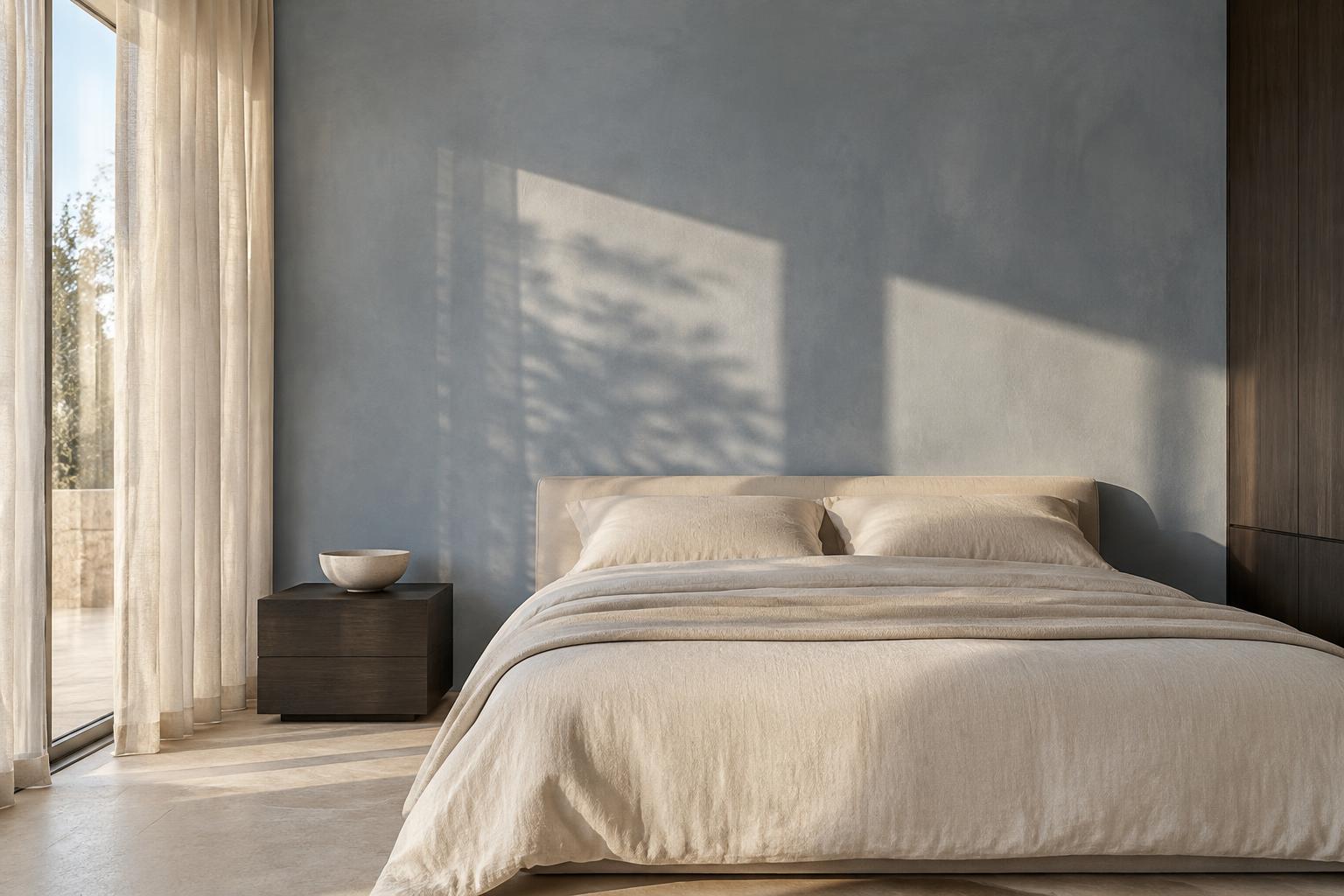
Using Contrast to Establish Architectural Definition
While harmonious palettes create visual continuity, carefully introduced contrast can bring structure and distinction to an interior.
Darker tones may be used to emphasise architectural elements, define individual areas or introduce a sense of depth within a larger composition.
A dark timber feature, sculptural furniture piece or richly coloured accent can become a considered focal point against a restrained backdrop.
The effectiveness of contrast lies in its proportion and placement.
When used excessively, pronounced differences in colour may disrupt the sense of continuity. When applied selectively, they create rhythm, guide visual attention and enhance the architectural qualities of a space.
Our approach favours measured contrasts that enrich the overall composition without compromising its sense of calm.
Developing a Colour Palette That Endures
Interior design should respond to the present while remaining relevant for years to come.
Although colour trends continually evolve, a timeless interior is defined by a palette that complements its architecture, materials and the personal preferences of its occupants.
This does not require eliminating individuality or avoiding expressive colours.
Instead, it involves understanding where colour can create lasting value and where a more restrained approach may offer greater flexibility.
Foundational elements such as flooring, architectural finishes and built-in cabinetry often benefit from a cohesive, enduring palette. Furnishings, artwork and decorative objects can introduce additional layers of personality that may evolve over time.
The result is an interior that feels contemporary without being dependent on temporary trends.
At Earendel, we believe that the most successful palettes are those that feel naturally connected to the spaces they inhabit.
A Considered Approach to Colour
The impact of colour in interior design extends beyond visual expression. It influences atmosphere, establishes spatial relationships and contributes to the way an environment is experienced every day.
From the quiet warmth of neutral palettes to the architectural depth created through contrast, thoughtful colour selection gives spaces their individuality and sense of balance.
At Earendel Designs, our approach is guided by the belief that exceptional interiors emerge from the careful relationship between colour, light, materiality and form.
Every selection is made with intention, creating spaces that feel cohesive, personal and enduring.
Discover Earendel Designs
Explore our approach to luxury interior design in Dubai, where considered colour palettes, refined materials and architectural understanding come together to create spaces of lasting beauty.